Styling charts: axes, colors and labels
Axes
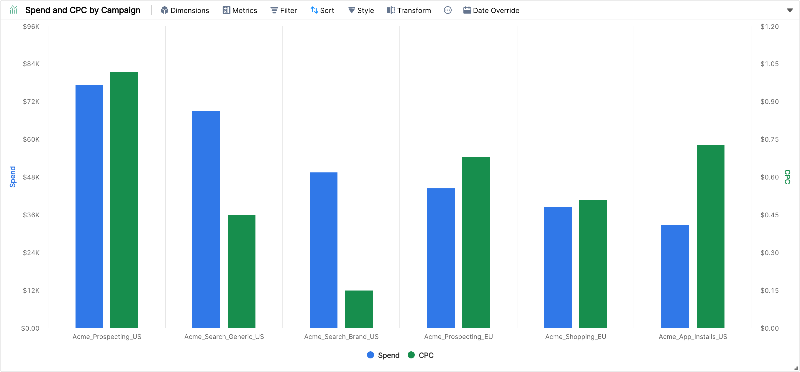
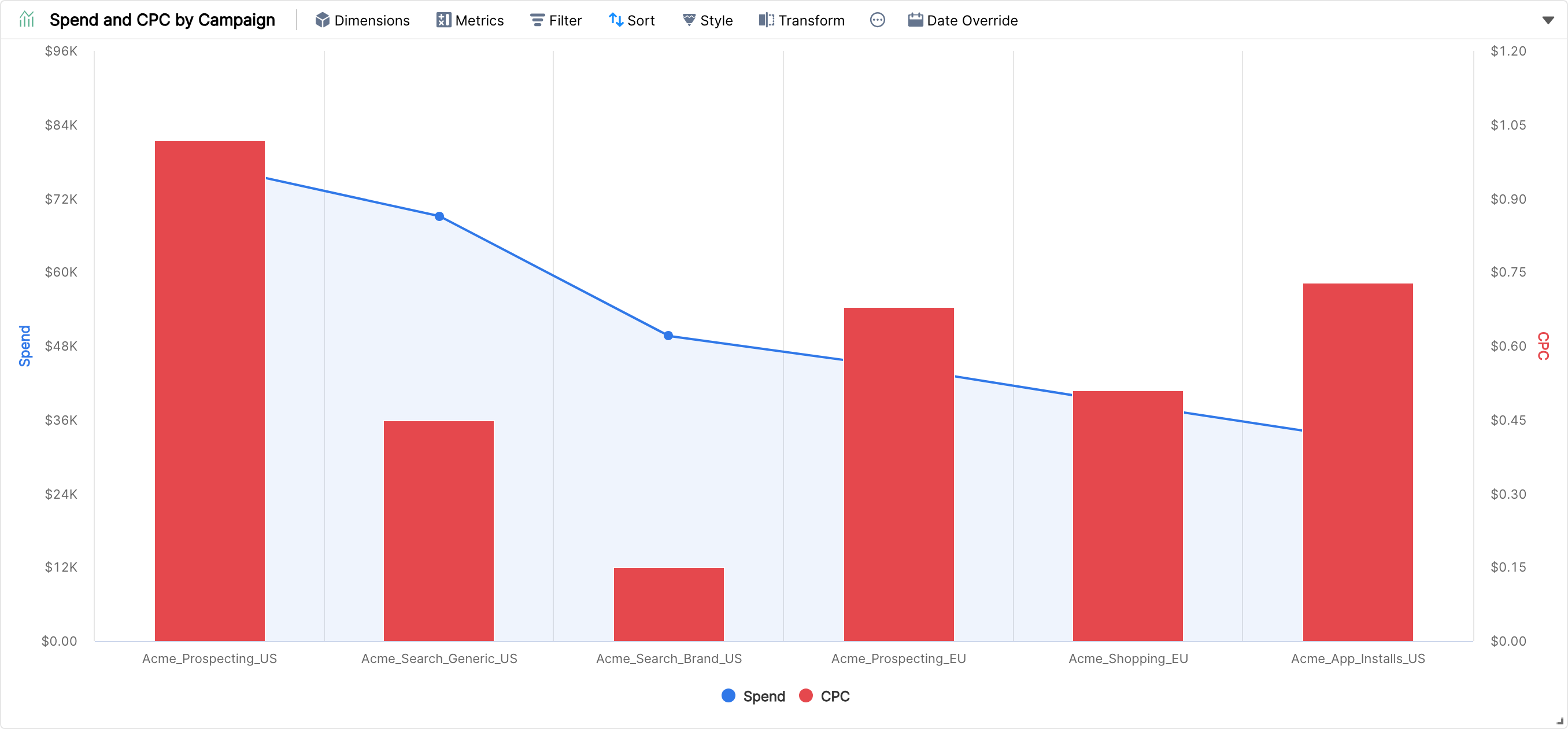
Axes let you put metrics on different scales, so metrics with very different ranges of values all stay visible. In this example, a combo chart has Spend and CPC as the metrics and Campaign as the dimension.
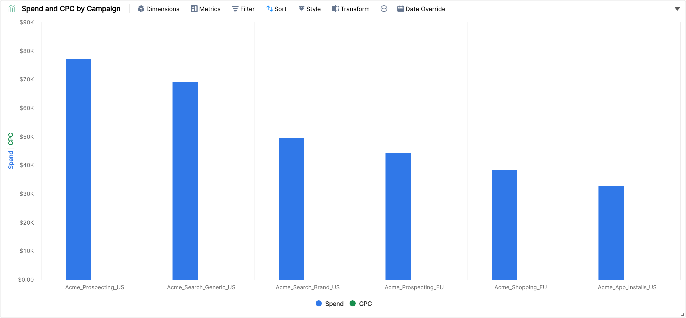
Spend and CPC are on the same scale. Spend for each campaign is far greater than CPC, so CPC needs its own scale to be visible. Click Style > Axes and drag CPC into the Drop here to add a new axis box. There's no limit on the number of axes in a chart.
Display Style
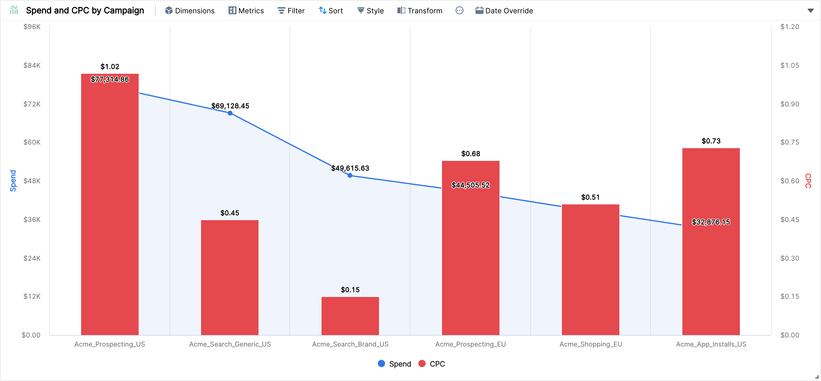
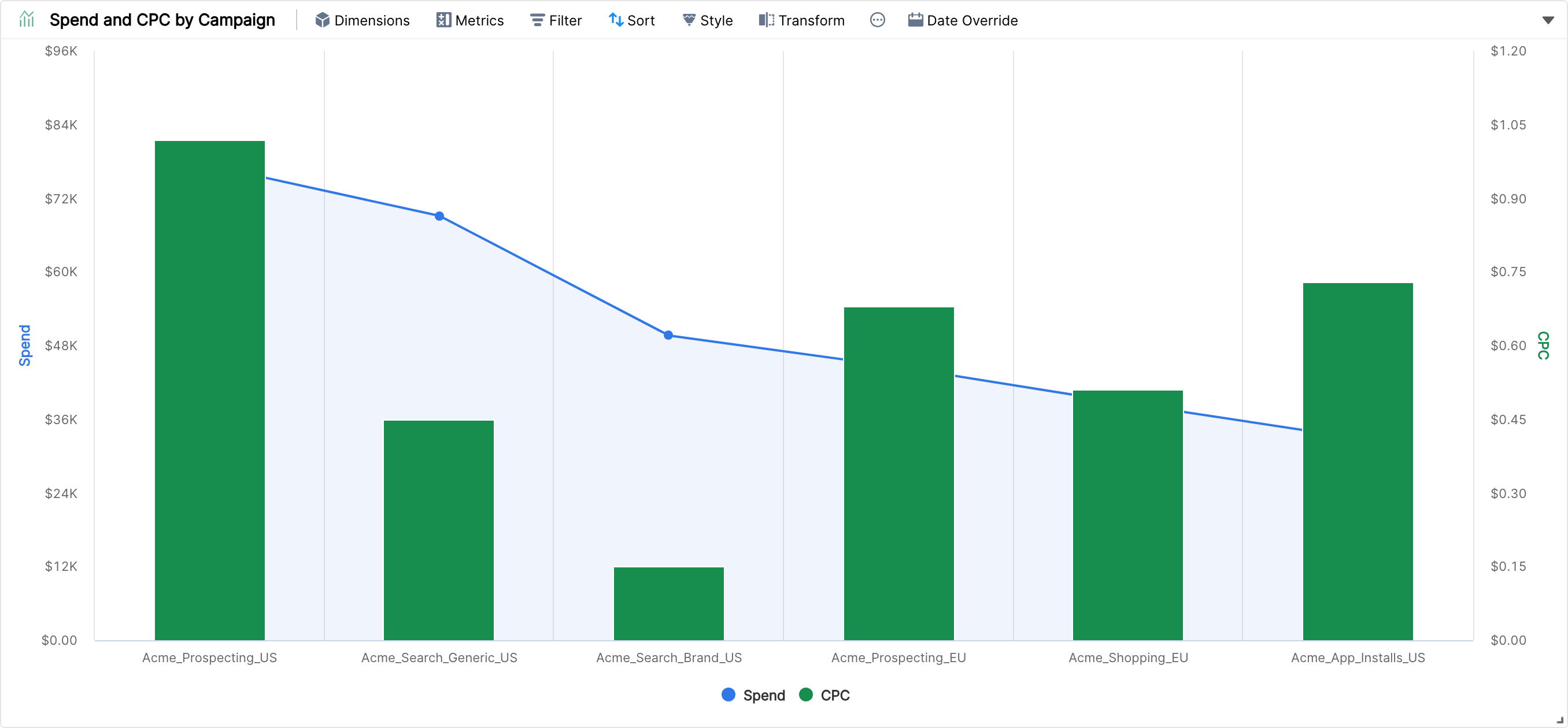
To show Spend as an area instead of columns, click Style, hover on the metric under Metric Styles, and pick the style you want (Spline, Line, Column or Area). In Combo and Timeline charts, each metric can have its own style.
Display Colors
Color coding helps you represent data visually in a meaningful way.
To show CPC in red instead of green, click Style, hover on the metric and pick the color. Different metrics can share the same color.
Color coding limitations
In some widgets the colors are set by the dimension values. In others, you control the color and style of each metric:
Breakdown, Stacked and Pie charts: each dimension value (for example USA, Canada, Germany) gets its own color, and you can't choose it.
Column chart, Timeline and other charts where color depends on a metric: you choose the color and style of each metric.
Bubble and Heat maps: color coding isn't supported, and only one color is used.
Funnel charts: colors are set per dimension value, as for Breakdown charts.
Chart Type | Color Coding |
Column chart | ✅ |
Area chart | ✅ |
Horizontal chart | ✅ |
Combo chart | ✅ |
Timeline chart | ✅ |
Breakdown chart | ⛔️ |
Stacked chart | ⛔️ |
Pie chart | ⛔️ |
Heat map | ⛔️ |
Bubble chart | ⛔️ |
Funnel chart | ⛔️ |
If you have any questions about color coding, contact our support team.
Labels
Labels show the values of the chosen metrics for each dimension value in a chart. To enable them, click Style and check Show Labels.