
Column chart widget
A column chart displays data as vertical bars. The dimension values are shown on the horizontal axis and the metrics on the vertical axis. Column charts are great when you want to compare aggregate metrics, such as spend or conversions, across markets, channels or campaigns.
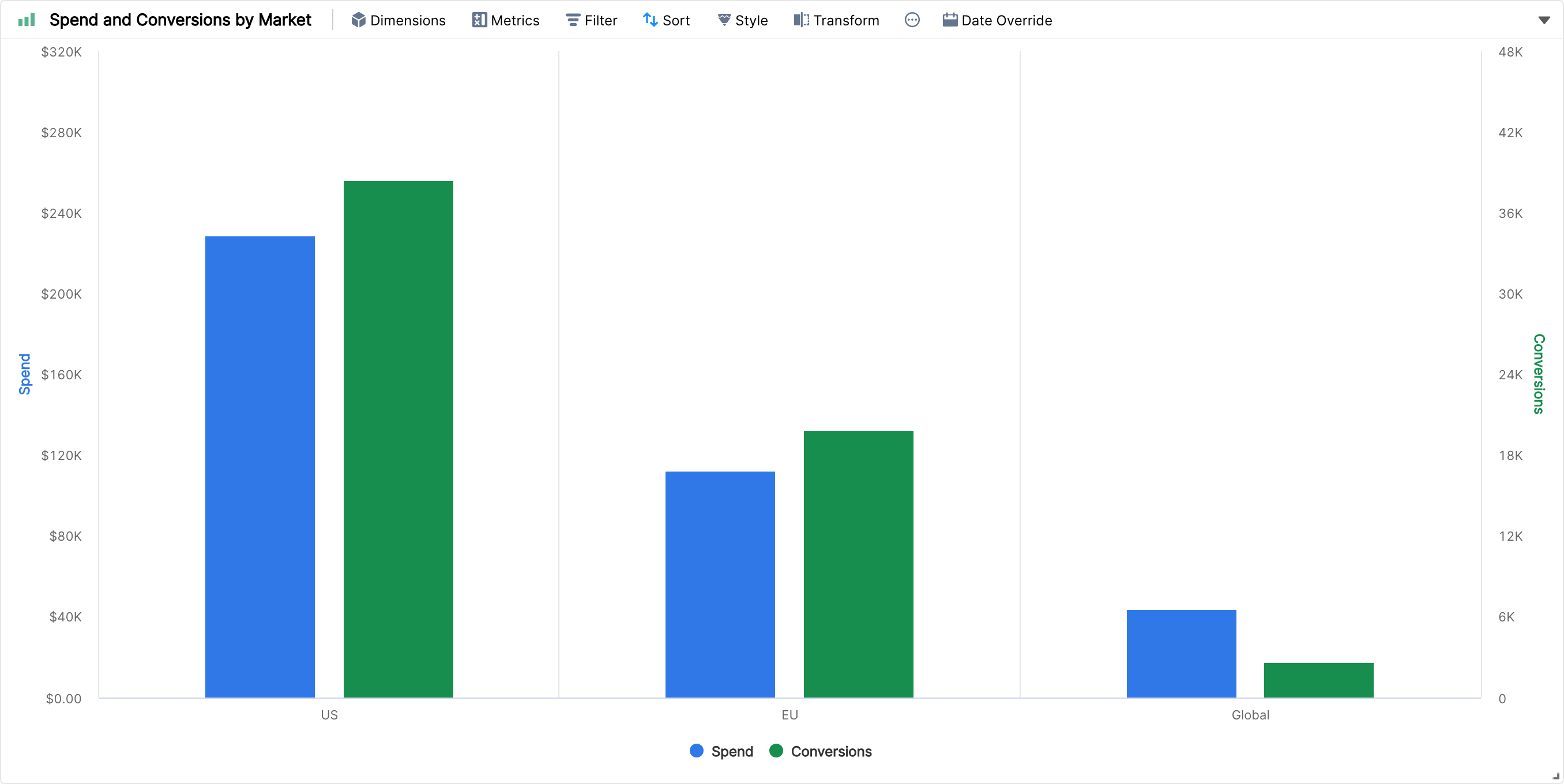
Creating a column chart
Click Create Widget below the tab bar of your report.
Pick Column chart in the widget type bar.
Add one or more dimensions under Dimensions and one or more metrics under Metrics.
Click Done to add the widget to your report.
What you can do with it
Multiple metrics: each metric gets its own colour. Under Style > Axes you can move metrics with very different scales (for example, spend and conversions) to separate axes, set custom minimum and maximum values, reverse an axis or hide grid lines.
Multiple dimensions: when you add more than one dimension, each combination of the dimension values becomes a separate column on the horizontal axis. Breakdowns are not available in column charts.
Labels: check Show Labels under Style to show the value on top of each column.
Number of items: use the drop-down at the top right of the widget to show the top 5, 10, 25, 50, 100 or 500 values. This option is not shown when the first dimension is a time dimension.
Filters, sorting and date override work the same way as in the other widgets.
If you want to show some metrics as lines or areas next to the columns, use a Combo chart instead, or switch the widget with Transform. Learn more about styling widget components and the other widget types.