
Table widget
The table widget shows your data in rows and columns. Each row is a value of the dimensions you choose (for example a campaign), and each column is a metric (for example Spend or ROAS). It is the best widget for exploring a large amount of data at once, and it has more analysis options than any other widget.
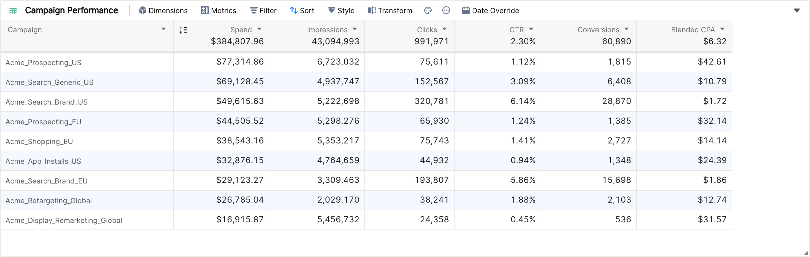
Creating a table
Click Create Widget below the tab bar of your report and choose Table in the widget type bar.
Click Dimensions and add one or more dimensions under Visible Dimensions. Drag them to change their order.
Click Metrics and add the metrics you need under Visible Metrics. You can add a whole metric group at once.
Click Apply, then Done.
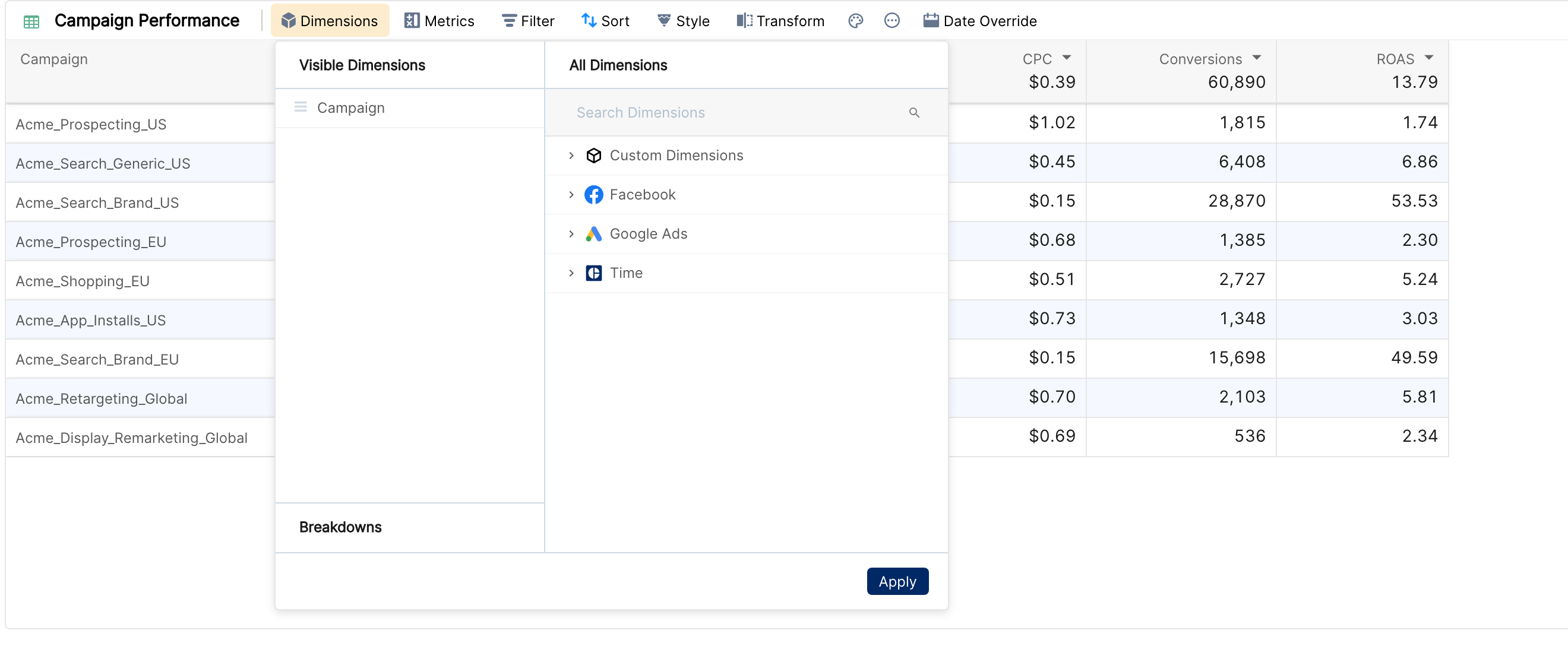
A table needs at least one dimension. Until you add one, it shows Now select at least one dimension.
The table toolbar
Every table has the same toolbar. If the widget is narrow, some buttons move into a More menu.
Button | What it does |
Dimensions | Choose the row dimensions and add dimension breakdowns. |
Metrics | Choose the metric columns and, if enabled for your account, add metric breakdowns. |
Filter | Limit the rows to the data that matches your conditions. See Adding filters to your widget. |
Sort | Set the primary sort and the sort inside breakdowns. See Sorting the data in a widget. |
Style | Auto Resize fits every column to its content. |
Transform | Change the widget into another widget type. See Transforming a widget. |
Palette icon | Conditional formatting. See Conditional formatting in the table widget. |
"..." icon (more options) | Column Aggregate, Show Share%, Show Comparison, Download as CSV, Copy Widget Link, Duplicate Widget, Duplicate Widget Here and Delete Widget. |
Date Override | Give this widget its own date range. See Date override for widgets. |
Arrow at the top right | Choose how many rows to load: 10, 25, 50, 100 or 500 items. See Number of visible rows in a table widget. |
Metric breakdowns
Metric breakdowns split every metric column into sub-columns, one per value of a dimension. For example, Spend and ROAS broken down by Market give you Spend (US), Spend (EU), ROAS (US), ROAS (EU) and so on, with an Others column for the remaining markets.
Add the breakdown dimension in the Breakdowns section of the Metrics panel. One breakdown applies to all metrics in the table.
Presets shows the top values (up to 5 for most dimensions, more for time dimensions such as Date or Week). Manual lets you pick up to 5 values.
Combine rest in "Others" adds a column for all values that are not shown.
Comparison, Share%, conditional formatting and trends keep working on the sub-columns.
Metric breakdowns are not enabled for every account. If you don't see Breakdowns in the Metrics panel, contact your account manager to enable it. The full guide is the article Metric breakdowns in the table widget.
Use cases
Split performance metrics by geography, creative concept, sub-channel and similar dimensions.
Split metrics by time buckets such as week, month or quarter.
Build "X vs everything else" views, for example CAC (Summer Sale promo) vs CAC (all others), or Revenue (DE) vs Revenue (rest of world).
Dimension breakdowns
Dimension breakdowns split each row into sub-rows by another dimension. Click the arrow to the left of a row to expand it.
Add breakdowns in the Breakdowns section of the Dimensions panel. You can add up to 10 levels.
Breakdowns are only possible when the table has exactly one dimension. Adding a second dimension removes the breakdowns.
For each level, Presets shows the top 5, 10, 15, 20, 25 or 50 values (50 by default) and Manual lets you pick up to 10 values. Combine rest in "Others" groups the remaining values in one row.
See Displaying additional data: breakdowns for step-by-step instructions.
Column options
Click the arrow on a column header to open the column menu.
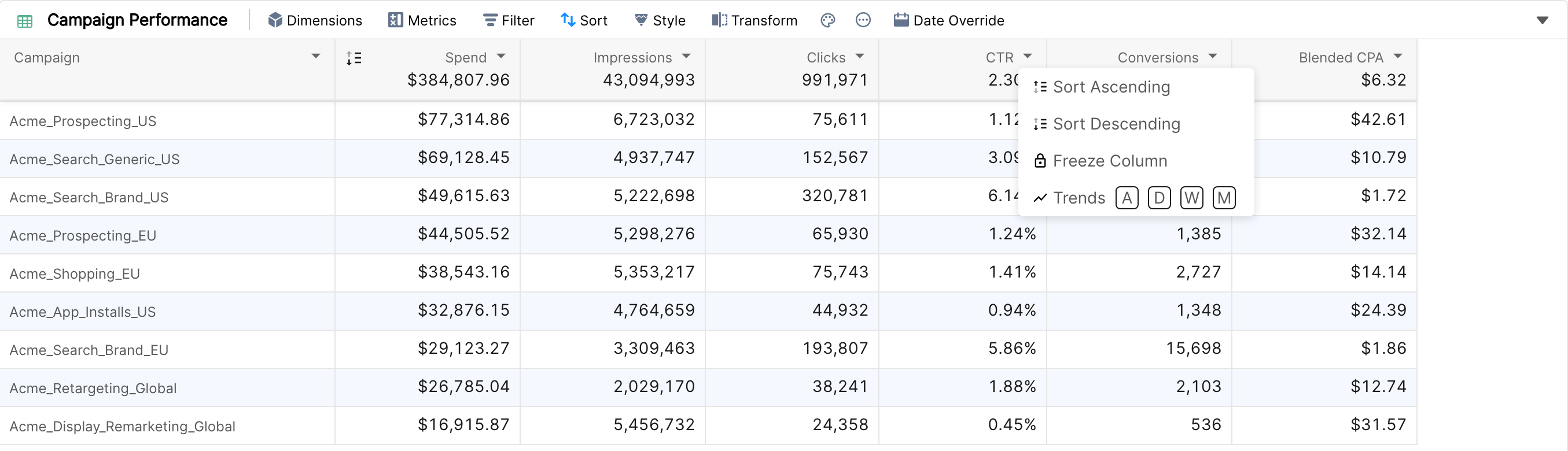
Sort Ascending and Sort Descending sort the table by that column. Once a column is sorted, click the sort icon in its header to switch the direction.
Freeze Column keeps the column visible while you scroll sideways. Unfreeze Column releases it.
Trends (metric columns): A, D, W or M adds a sparkline to each cell. See Displaying additional data: trends.
Show Marginal Comparison appears for custom metrics that support it. See Marginal comparison.
Slice Column creates a filtered copy of a metric column, if metric slices are enabled for your account.
Drag the edge of a column header to resize the column. The dimensions used as breakdowns are listed in the first column header.
Extra data in cells
From the more options menu ("..." icon) you can add:
Column Aggregate (on by default): the total of each metric, shown in the column header.
Show Share%: each row's share of the total, next to the value.
Show Comparison: the value for the comparison date range and the % change.
See Displaying additional data: aggregate, share and comparison.
Note: a cell shows one extra line at most. Trends take priority over marginal comparison, which takes priority over comparison. When trends are on for a column, its comparison is only shown in the header.
Things to know
Number formats (currency, decimals, percentages) come from the metric definition. The table has no separate number format setting.
Tables don't have pages. The table loads the top rows according to the sort and the item count you chose, and you scroll through them.
Downloads are CSV files. The download is prepared in the background and starts automatically when it's ready.
To summarize one metric across two dimensions, use a pivot table.