
Bubble chart widget
A bubble chart shows two or three metrics for each value of a dimension on a single chart. Two metrics form the axes of the chart, and an optional third metric sets the size of the bubble. Each value of the chosen dimension gets one bubble.
A bubble chart needs exactly one dimension and two or three metrics.
Here's an example of a bubble chart of campaigns:
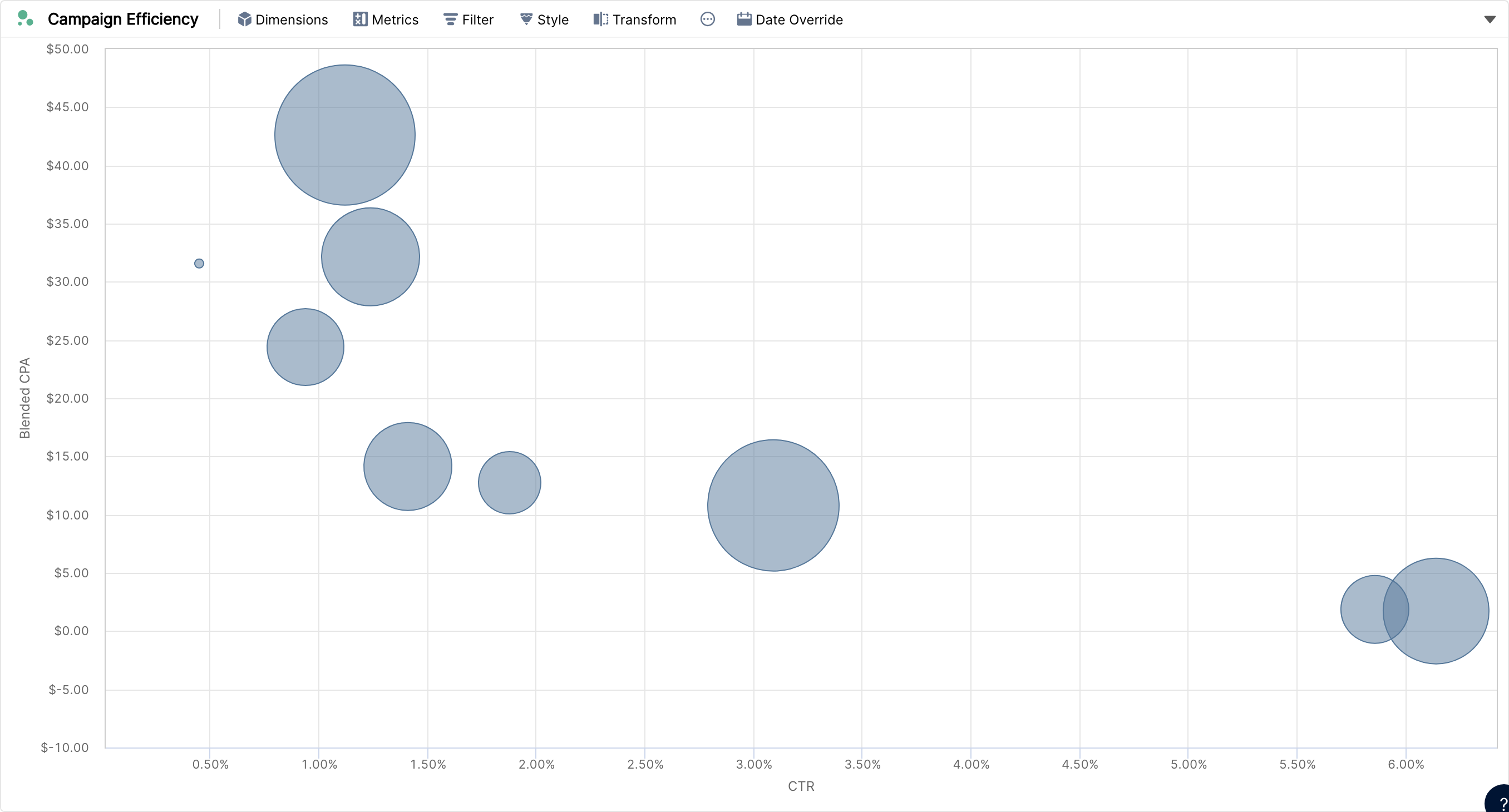
The dimension is Campaign, and the three metrics are:
CTR: the x-axisBlended CPA: the y-axisSpend: the size of the bubble
When to use a bubble chart
Use a bubble chart to show two or three metrics for a dimension. Bubble charts are great at showing relationships within your data and at representing a large amount of data.
They are also good at finding outliers. In the chart above, the two campaigns on the right have a much higher CTR and a much lower CPA than the rest. Hover over a bubble to see its values.
How to create a bubble chart
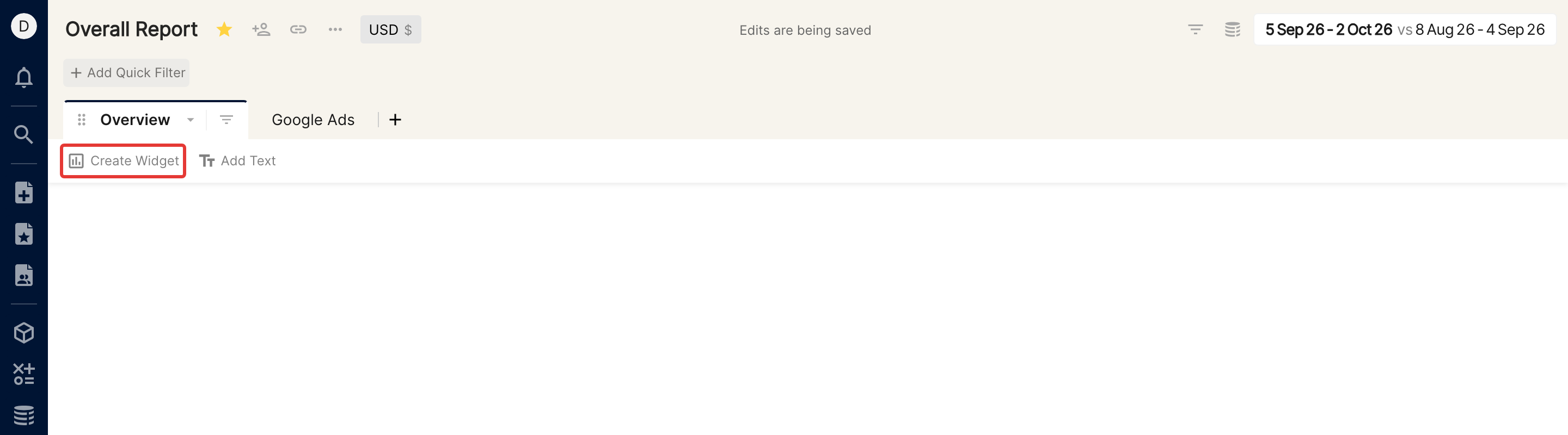
Click Create Widget and choose Bubble Chart as the widget type.
Add the dimension and metrics.
Click Done.
Learn about other widget types in Clarisights.